So, let's talk Flexbox. When you think for a second about what it offers and how easier it would make your life as a front-end dev, you realise that the plain old CSS you've been using (and learned to cherish) is pretty much crippled. How hard should it be to vertically center something, or to evenly distribute elements across the width of a container?
I won't go through everything Flexbox can do for you, because other folks did a great job on that. Instead, I'll describe my experience with using it on a commercial project for the first time.
I've been wanting to use Flexbox for ages, but browser support was always an issue, with Internet Explorer being the most problematic case — it's IE10+, even though version 10 still ships with an outdated implementation (see the differences here). My team works under the requirements of building for IE9+ (or 10+, depending on the project), so on countless times I've said "man, Flexbox would be perfect for this" shortly followed by "yeah, but we can't use it". Until today.
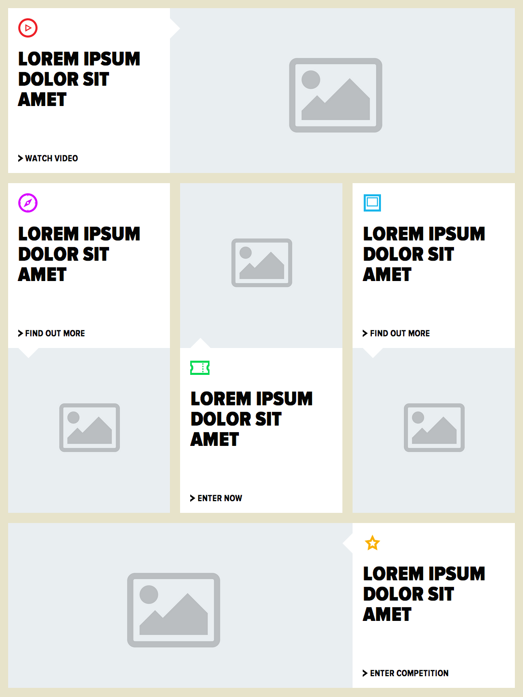
This is a mockup of the page I had to build. Right off the bat you can tell that Flexbox would be perfect for building this layout, especially when it comes to maintaining the same height within a group of elements, but I've made peace with the fact that I can't rely on it for such a critical thing — browser support, browser support, browser support.
Even without Flexbox's help, this layout can be easily built in plain CSS, but what happens when we get to a narrower viewport? How can we make this mobile-friendly? The more obvious approach is to say that up until a certain viewport width all the columns should take the full width of the page.
/* Something like this */@media (max-width: 767px) { [class*="col-"] { width: 100% !important; }}This works absolutely fine, but there's a caveat associated with the fact that our layout alternates between displaying articles with copy first and then image and the other way around. Naturally, the DOM structure will reflect that, so this is what will happen when we get to a mobile view.
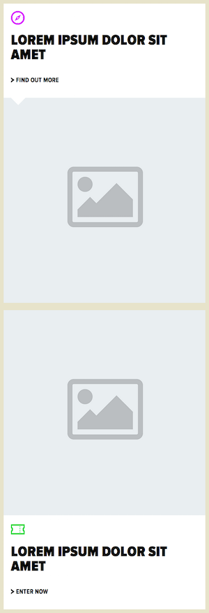
Because the articles are being stacked on top of each other and the natural order of the elements in the DOM is preserved, we will sometimes see two consecutive images or two consecutive pieces of copy which is not what we want, since it might confuse users as to what image a bit of copy is associated with. Ideally, we would display all the articles in the same way on mobile: first copy, then image. But how can we do this? Yes, we could use JavaScript to detect if we're on a mobile viewport (probably attaching that check to a window resize event) and then swapping the DOM elements around when necessary. YIKES! That sounds awful.
Flexbox is capable of reordering elements regardless of their position in the DOM tree, simply by adding a order property to the element. Ah, but browser support... Wait, this case is slightly different, isn't it?
The full desktop view works fine for every browser, it's only when we get to mobile that we want to reorder some elements, so we start narrowing down the percentage of users affected by the lack of support for Flexbox.
If you only care about supporting Flexbox for mobile users then things don't look so bad. The most problematic browser is, unsurprisingly, Internet Explorer, which only started shipping the modern specification on version 11. But who runs older versions of IE on a phone anyway? On the Apple world, Mobile Safari started supporting it on iOS 6.1, which means that currently 97% of iPhone/iPad users can use it (as of January 19, 2015). On Android things don't look so great though, since support for Flexbox came with version 4.4, which at the moment represents only 39.1% of users (as of January 5, 2015). More on these numbers later.
¶ Let's Flexbox it, then
So how exactly can Flexbox help us here? Simple.
/*I'm omitting the browser prefixes,but they're required on iOS Safari*/article { display: flex; flex-wrap: wrap;}.image:first-of-type { order: 1;}Yep, that's it. So what's happening here? We start by saying that every <article> will be a Flexbox container. By default, Flexbox will try to fit all the elements side-by-side, so we need to say that's it's fine for the elements to wrap (line 7).
Finally, we target all the image containers that are also the first element of their type in their container (matching the articles where the image comes first, which are the ones we want to re-order) and say that their order should be 1. The default order for an element is 0, so changing the order of .image to 1 is enough to swap the order of the elements around.
Here's a pen that replicates that layout and illustrates how Flexbox solves our issue (try resizing your browser above and below 768px).
See the Pen [Blog] A cautious and calculated venture into Flexbox by Eduardo Bouças (@eduardoboucas) on CodePen.
¶ Final thoughts
I wish I could use Flexbox at will in production, but I can't. Not while I'm asked to support older versions of Internet Explorer. Even in the world of mobile devices, not everyone is onboard yet. But the point of this post is to describe a use case where using it is actually acceptable, due to the conjunction of two key factors:
- We don't rely on Flexbox to correctly display the site for everyone; we're only using it for mobile users and thus eliminating the problem of it not being supported by older versions of IE.
- The layout is still perfectly functional (i.e. doesn't look broken) when Flexbox is absent. In the worst-case scenario, users with older phones will see some articles with the image before the copy. The experience is not ideal, but we're not depriving the users from any feature of the website.
So that was my first experience with Flexbox in production. The benefits were clear, the risks were identified and measured and the result is satisfying. Let's just pray for a quick and quiet death for ancient browsers so we can all use modern web techologies without feeling we're committing a sin. ∎