I have recently refactored the entire front-end structure of my website (a bit by accident, actually) and using the BEM naming convention on my DOM tree was one of the things I finally got to implement. In a nutshell, BEM brings concepts of object-oriented programming to your HTML and CSS.
As Philip Walton explains in his brilliant article Side effects in CSS, BEM helps you avoid a problem that is known to all front-end developers: sometimes your CSS ends up affecting elements that it wasn't supposed to. That happens because of the cascading nature of CSS and the fact that all the class names belong to a global namespace.
With BEM, every HTML tag has to have a class and that's how it will be styled, as stylesheets can only contain class selectors. Those classes follow a very strict naming convention and can be of one of three types:
- Block: A self-sufficient and independent entity. A building block of the application.
- Element: A part of a block. An element depends on the block it is part of and doesn't make sense without it or in any other context.
- Modifier: Represents variations of state of the block.
This is how the DOM structure of my blog posts looked like before BEM:
<article class="post"> <header> <h1></h1> <p class="post-meta"><!-- (...) --></p> </header> <div class="excerpt"> <p><a href="">Read full post</a></p> </div></article>And here's how it looks after BEM:
<article class="post"> <header class="post__header"> <h1 class="post__title"></h1> <p class="post__meta"><!-- (...) --></p> </header> <div class="post__excerpt"> <p><a href="">Read full post</a></p> </div></article>Right off the bat, it makes DOM elements more structured and tightly coupled. But what about the CSS? If every element in the page can be targeted by a unique and unambiguous class name, then in theory I should be able to reduce the amount of nesting in my Sass code and see a lighter, more compact and less specific resulting CSS.
To measure that I used Jonas Ohlsson's CSS Specificity Graph Generator to see how the specificity of my shiny new BEM-powered stylesheet looked like when compared to the previous version using the plain old habit of naming things randomly. Here's how it looks:
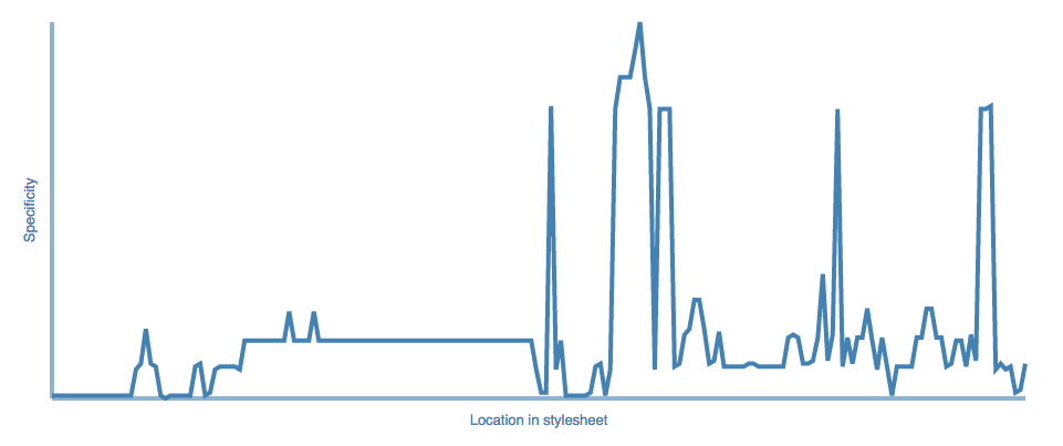
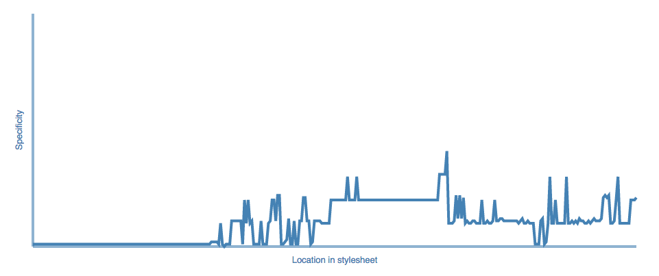
¶ Here's what I make of it
As Ohlsson points out in his website, «spikes are bad, and the general trend should be towards higher specificity later in the stylesheet.» so I guess it worked alright for me. But I'm sure I would see even better results if I could rigidly enforce BEM on every element on the site, which I can't.
I use Jekyll to power my site and it actually generates a lot of the markup for me, which means that I don't have full control of what goes into my DOM tree — i.e. I can't ask Jekyll to append BEM-friendly classes to elements. For this reason, I sometimes have to turn a blind eye to some of BEM's rules and do things like styling elements by tag name and not by class.
Also, because my website relies on a HTML5 video sequence, I have to cater for devices that a) don't have a big enough screen to show the video sequence in a way that makes sense or b) can't automatically play HTML5 videos without user interaction (I'm speaking iOS here). As a result, I have to use Modernizr to detect some features and create a whole new experience for certain users. That means saying things like "apply these rules if the device is smaller than a tablet or there's no support for HTML5 video autoplay".
@mixin mobile-flow() { .no-videoautoplay & { @content; } @include media('<tablet') { @content; }}body.body--mobile-flow { @include mobile-flow() { .bust, .menu, .background { left: -100%; transition: left $mobile-menu--transition; } .content { width: 100% !important; margin-left: 0 !important; transition: margin-left $mobile-menu--transition !important; &:not(.content--allow-expansion) { padding-left: 10px !important; padding-right: 10px !important; } } }}Yes, you see some overly-specific selectors, you see !important and you see nesting. That was all necessary to deal with the very specific case I had in hands and I reckon that's what stops me from having an even better specificity graph. I would say that BEM definitely helped and it did as much for me as it possibly could.
I've been using BEM in production on all my projects and I don't look back. ∎