I finally got around to dedicate some love and attention to my site, in much need of a redesign. Its first iteration consisted of a sequence of 3 background videos depicting a guy walking around and sitting on a chair as users navigated the pages. It was published over two years ago and it reflected who I was at the time — a creative developer fascinated by the cutting-edge front-end technologies capable of creating unique visual experiences on the web. In its turn, this new iteration reflects my path since then and how it shaped me along the way.
Incidentally, my career shifted towards working with publishing companies — first at Monocle, then Time Inc. and now with different projects at DADI+. That experience made me more sensible to the fact that content is ultimately what matters and what people come back for, much more than any (nonetheless cool) gimmicks and tricks that front-end developers pull off.
So my goal for this redesign was to create a pleasant, elegant and uncluttered reading experience. To look for inspiration, digital platforms that get it right (like Medium) were the obvious suspects, but in the end I found solace in something that goes way further back in time: print design.
¶ Big typography
The first thing that catches your eye when you hold a newspaper is the big typography used for the main headlines, with words sized and arranged in a way that perfectly fills the available space, like a lock-up. Whilst mundane in print design, this concept is not so trivial when transposed to the world of responsive web design.
Simply taking a h1 and setting the font to a huge size won't do the trick — variable content and viewport dimensions mean that the end result will almost always contain undesired spacing, widows and orphans, far from the clean look of a newspaper.
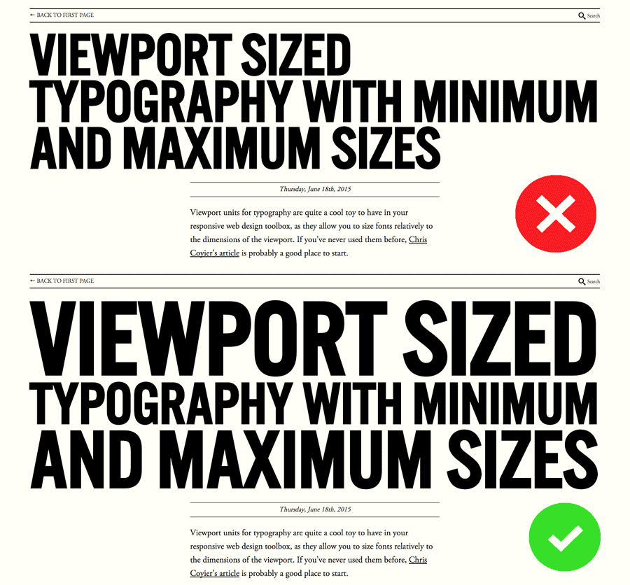
To achieve this effect I would have to separate each line of the title into its own separate element and size it proportionally, based on the amount of space it naturally takes compared to the size of its container. My plan was:
-
Write a piece of logic that takes a title and generates a number of sub-elements with approximately the same number of characters, respecting words. The output will be a variable number of
<span>elements, all set to the same font size and to never wrap. -
Calculate how much space each line naturally takes relative to its container, and compensate by sizing it proportionally using percentages. For example, if I calculate that a line takes up only 800px of its 1000px container, I apply
font-size: 125%to it. Conversely, if it's too long and takes 1600px, a font size of62.5%will bring it back down to the full width of its container.
<!-- I was thinking something along these lines --><h1 class="post__title feature-title"> <span class="feature-title__part" style="font-size: 239%;" >Viewport sized</span > <span class="feature-title__part" style="font-size: 135%;" >typography with minimum</span > <span class="feature-title__part" style="font-size: 187%;" >and maximum sizes</span ></h1>My initial plan was to do it all on the server (or "at generation time" in Jekyll world). I picked a font, measured how much horizontal space each different letter of the alphabet would take at a reference font-size (100px) and from there got the total width for each line. To make it responsive, I would make use of viewport-sized typography to keep the proportion between lines and their container locked.
As a first test, I put together a tiny bit of JavaScript to automate the above and generate a map with the width of each letter of the alphabet.
Browsers render the some font very differently, making any pre-calculations pointless.
It all worked beautifully well and I was able to replicate the headlines shown above on Google Chrome, but unfortunately browsers render the same font very differently, making any pre-calculations pointless. The map I generated would only make sense for the particular browser, and maybe even the operating system, it was generated on.
Eventually, I resorted to doing this calculation on the client, with JavaScript.
/* Using jQuery to demonstrate for simplicity, but it's absolutely *not* essential. */function adjustFeatureWidth() { var $feature = $(".feature-title"); var containerWidth = $feature.parent().width(); $feature.children(".feature-title__part").each(function() { $(this) .attr("style", "") .css({ display: "inline-block", opacity: 0 }); var fontSize = Math.floor((containerWidth / $(this).width()) * 100); $(this).css({ "font-size": fontSize + "%", display: "block", opacity: 1 }); });}Elements need to be set to display: inline-block before they are measured, so they take up exactly the space they need and not the full space of the container. They also need to have white-space: nowrap so that their full width is considered when measuring, even if it means breaking out of its container. Finally, I'm setting setting opacity: 0 so users don't see text changing size and jumping around; we'll set the opacity back to 1 once all adjustments have been made.
We calculate the proportion of each element's width relative to the container as a percentage and set that as font-size. The element needs to be changed to display: block at this point to avoid weirdness with line height. Finally, we turn the opacity back to 1, which will fade in smoothly thanks to a transition set in the style sheet. All this needs to happen every time the window is resized (debouncing highly recommended when binding to the scroll event).
To keep the markup meaningful and accessible, I added a copy of the full title to the h1, which will be hidden by default. I will also use it to create the mobile view, as I don't want the newspaper effect on narrow screens. This is how the final markup looks like:
<h1 class="post__title feature-title"> <span class="feature-title__full" >Viewport sized typography with minimum and maximum sizes</span > <span aria-hidden="true" class="feature-title__part" style="font-size: 239%;" >Viewport sized</span > <span aria-hidden="true" class="feature-title__part" style="font-size: 135%;" >typography with minimum</span > <span aria-hidden="true" class="feature-title__part" style="font-size: 187%;" >and maximum sizes</span ></h1>The Liquid partial used to break the title into separate elements can be found here.
¶ Wrapping up
If you're interested in print layouts on the web, there's a piece by Chris Coyier on web type lockup that is definitely worth checking out. He also had a go at a few implementations of print-inspired layouts himself.
Now with the new design done and dusted, I can finally focus on writing regularly to keep this digital newspaper blossoming with fresh words. Now watch me, as I fail miserably. ∎