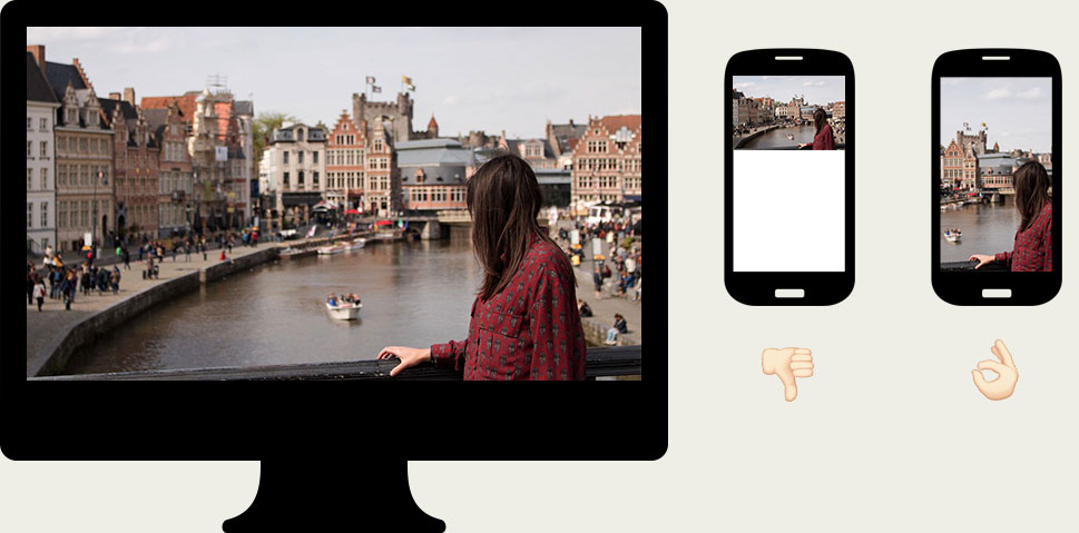
Responsive images on the web are an incredibly powerful tool. The most basic use case is the ability to load different versions of an image, with different sizes and resolutions, based on the user's viewport dimensions, which can avoid sending huge images across the wire to a device with a small screen.
But even more exciting than that is doing art direction on images, which is what I'll cover here.
If all you need is to display the same exact image with different sizes or resolutions, then the plain old <img> element with the srcset attribute is what you're after. The syntax allows you to define multiple source files for an image and helps the browser figure out which one to deliver.
But if you want to deliver different crops of an image based on certain conditions, such as viewport dimensions or orientation, then the <picture> element is the answer.
Displaying a landscape image on a portrait device is a common challenge developers are faced with, as simply displaying the original image in full width often produces suboptimal results — the image looks tiny and detail is lost. We want to have multiple crops of the image and display the one that best fits the user's device.

This can be achieved with the <picture> element, and the markup would look like this:
<picture> <source media="(orientation: portrait)" srcset="http://my-site.com/img-portrait.jpg" /> <img src="http://my-site.com/img-landscape.jpg" /></picture>This is great, but it comes with a challenge: we now have to generate multiple crops for each image that is to be displayed on the site. This creates a huge overhead and can quickly become a heavy burden to an editorial workflow.
¶ Cropping on-the-fly
Ideally, we would have a single image file in its original dimensions and then generate the various crops as needed, on-the-fly. This can be done with the just in time image manipulation system of DADI CDN, an open-source asset manipulation and delivery platform.
A crop can be obtained by requesting the image with specific URL parameters. The following URL would get a 400x600 crop, with the top left corner on the coordinates 600,150:
http://cdn.url/img.jpg?width=400&height=600&resizeStyle=crop&crop=600,150,1000,750
We can use this on the <picture> element to generate the various crops from a single file:
<picture> <source media="(orientation: portrait)" srcset="http://cdn.url/img.jpg?width=400&height=600&resizeStyle=crop&crop=600,150,1000,750" /> <img src="http://cdn.url/img.jpg" /></picture>This eliminates the need to manually generate different image files, so the only overhead we're adding to the workflow is having to find the coordinates for each image crop. But even that can be automated.
¶ Automating crop generation
The latest version of DADI CDN introduced a content aware cropping mode, which analyses an image and provides crop coordinates for a given width and height based on the image contents.
For example, a 400x600 crop can be obtained with this syntax:
http://cdn.url/img.jpg?width=400&height=600&resizeStyle=entropy
Finally, by applying this to the <picture> element markup we can provide as many variations of an image as we want, without having to do any of it manually.
<picture> <source media="(orientation: portrait)" srcset="http://cdn.url/img.jpg?width=400&height=600&resizeStyle=entropy" /> <img src="http://cdn.url/img.jpg" /></picture>Check out this pen for a demo. ∎
