I have always had a deep fascination with objects that bridge the physical and digital worlds in creative ways. A few years ago, I built a web-connected traffic light as a first exploration into this area and since then I've been wanting to take on a bigger project.
I knew I wanted my next project to have something to do with maps, since I love cartography. Given that my job involves building and operating Netlify's globally distributed CDN, I started wondering: could I build a map that shows live CDN traffic?
My overconfidence in tinkering and my knack for committing my future self to large projects that I don't have time for had found the perfect project.
My plan was simple on paper: take a world map, add addressable LEDs for capital cities and major regions, and control everything via software.
¶ The map
The first thing I had to figure out was the map itself. I felt that using an organic material and adding electronics on top would embody that contrast between the physical and digital worlds that I was going for, so I went for a wooden map.
I spent a few weeks studying the best option, having considered building one myself at one point — I'm glad I talked myself out of it. Eventually I came across this shop, which makes laser-cut wooden world maps. It's exactly what I needed.
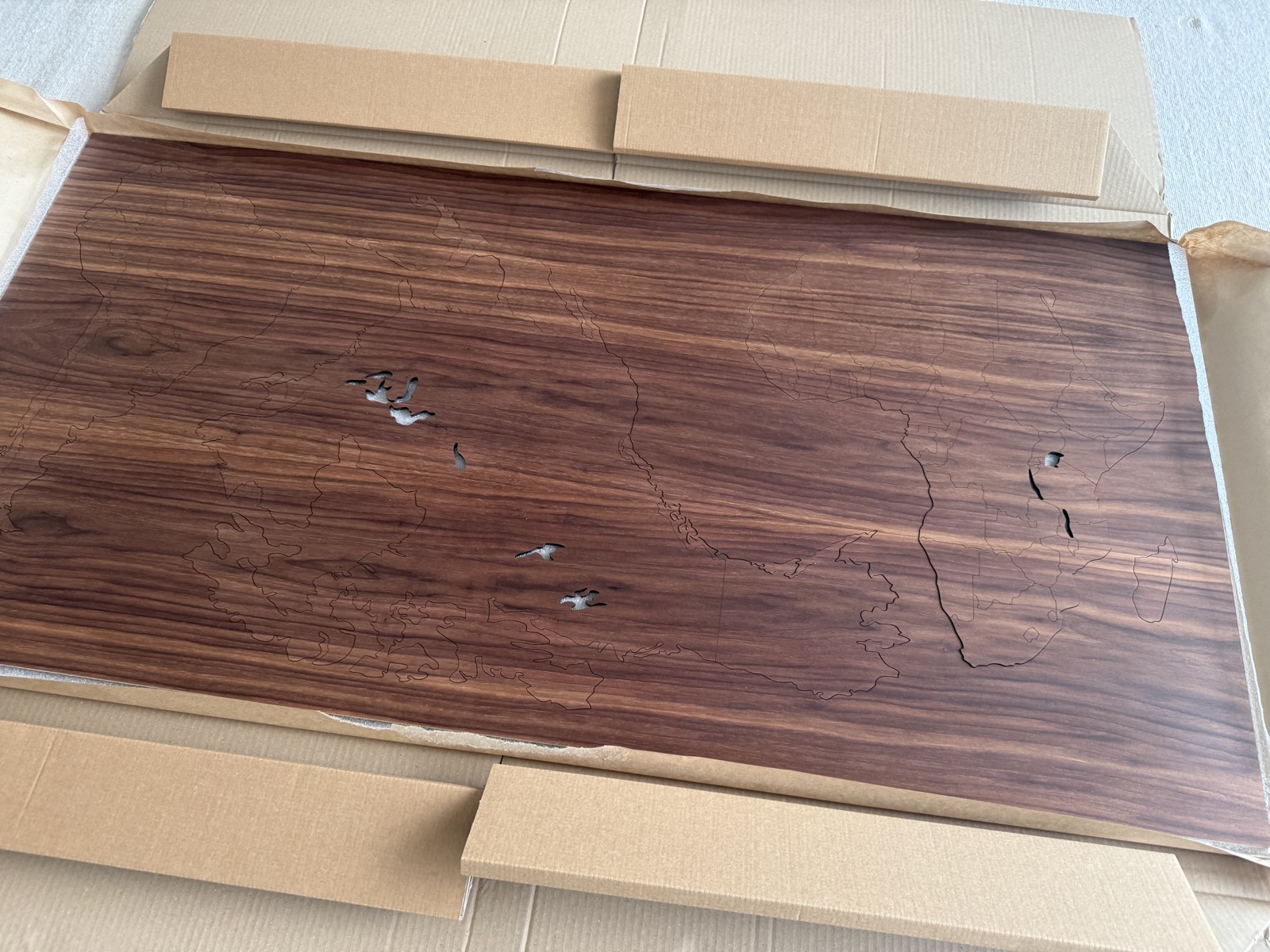
Before any drilling, I had to decide what the map would actually show. The obvious starting point was one LED per country, placed at its capital. But that had some challenges.
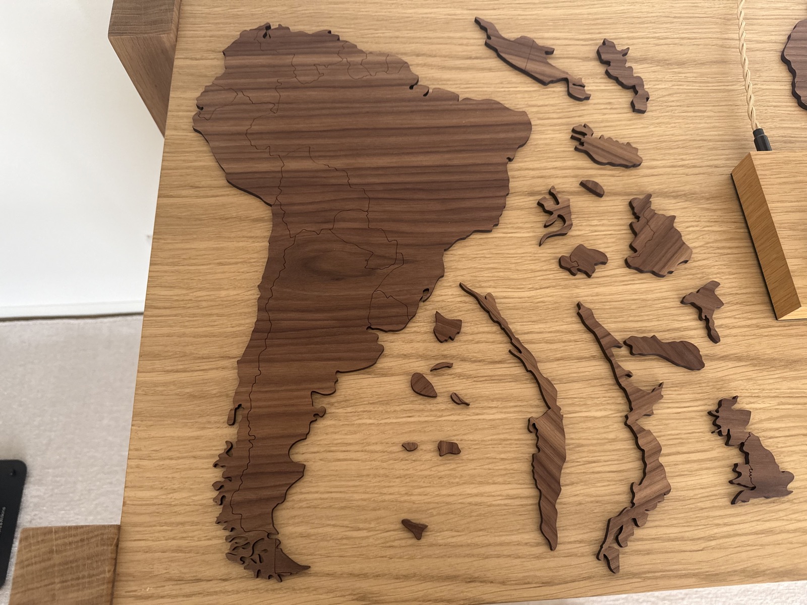
First, some countries were impossible to represent on a two-metre map. Small island nations were not even included in the map I bought, and if they were they would be so tiny that it would be impossible to put an LED on them.
On the flip side, countries like Russia or the US are so large that putting just one LED on them would make the map look too empty.
So I had to make some compromises. Where countries were too small or too tightly packed, I grouped neighbours onto a shared marker. And for very large countries, I marked several administrative regions (like states or provinces).
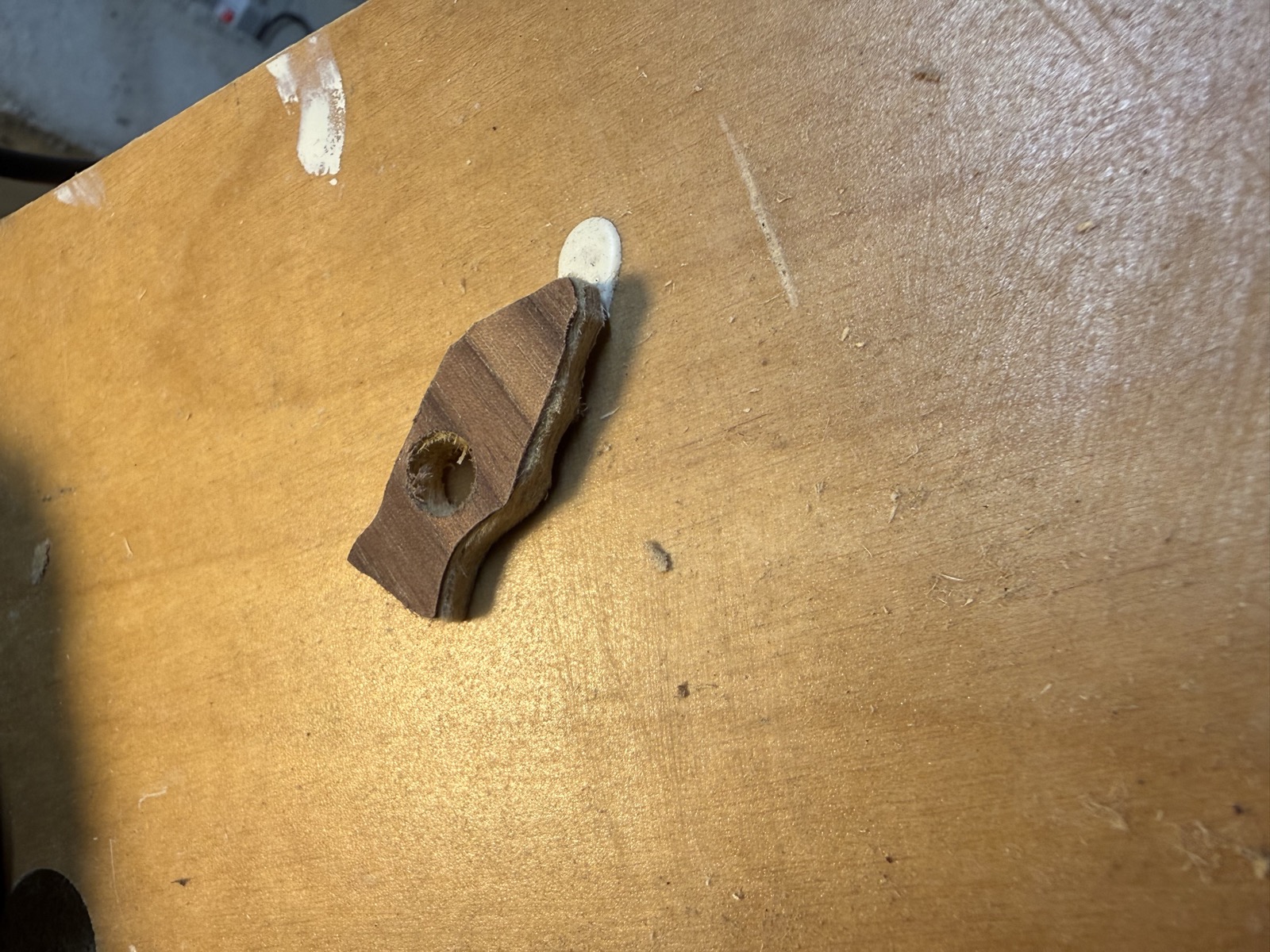
¶ The Florida incident
With the points marked on the wood pieces, it was time to drill. This is when you need to be patient and take your time. I did not do that.
Florida, as it turns out, is a thin peninsula of plywood with very little holding it to the rest of North America. While I was drilling a hole near its tip, half of the peninsula snapped off.
After questioning my life choices for a bit, I used a piece of scrap wood from the template cutout and terraformed a brand new Florida, sanded it to shape, and glued it back into place.

¶ The electronics
For the electronics, the bill of materials was fairly simple. I went for WS2811 9mm RGB addressable LEDs, controlled by a Raspberry Pi.
There were some additional components I needed, like a level shifter that raises the Pi's 3.3V data signal up to the 5V the LEDs expect (the LEDs themselves are powered separately, at 12V). Claude helped me put all of this together.
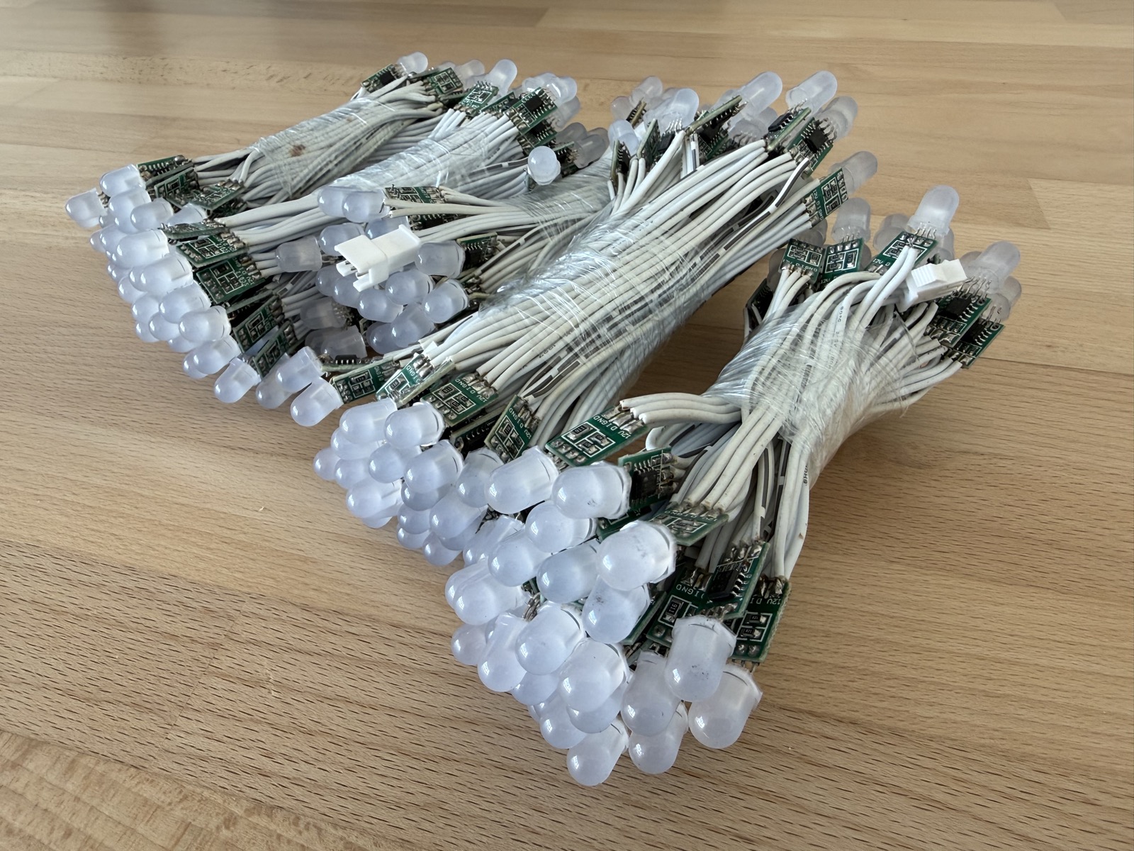
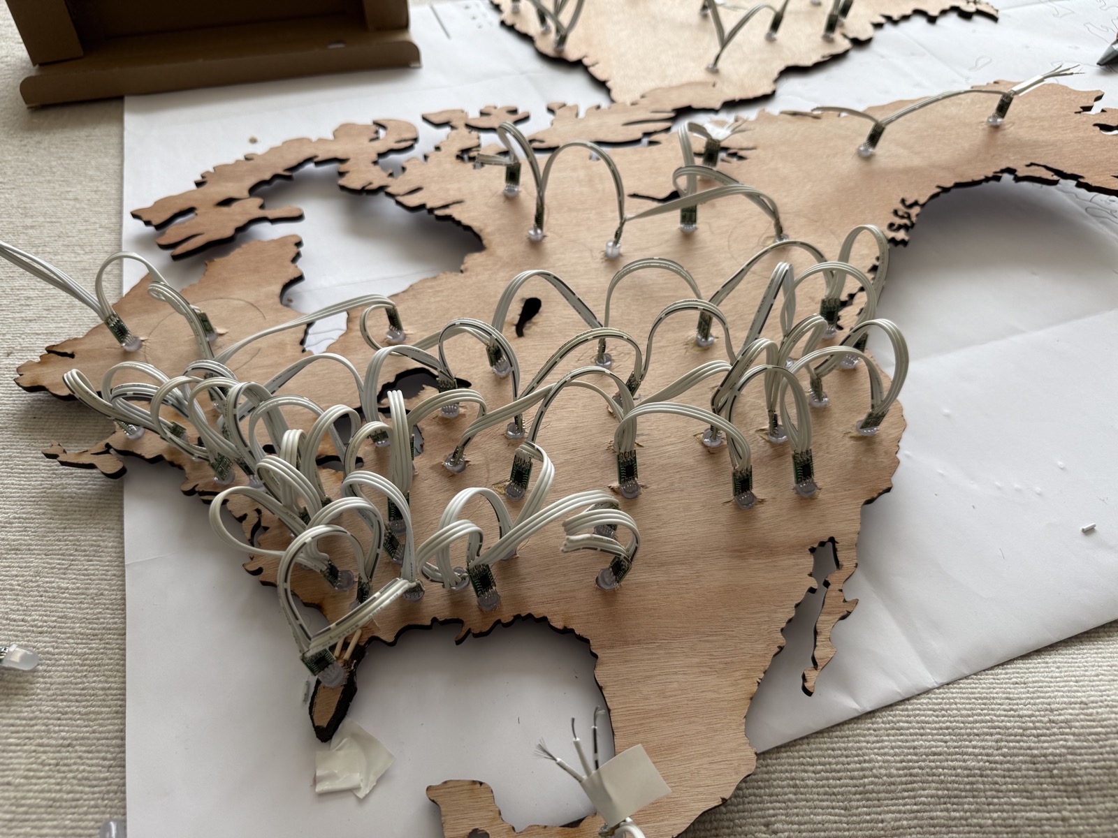
I have 247 LEDs in total. Their data signal is wired in series, but I have grouped them into five modular clusters that get independent power, to avoid voltage drops on long cable runs.
¶ Mounting
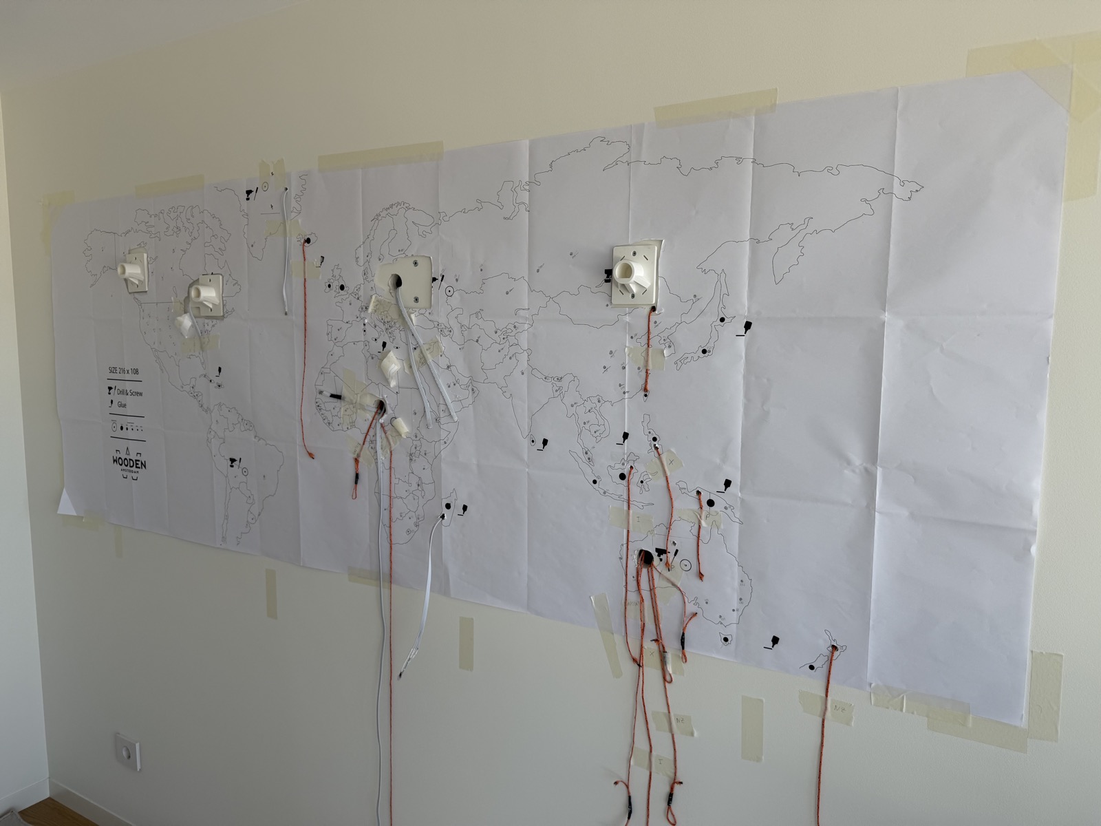
I wanted the front of the map to be nothing but wood and light, with as few cables in sight as possible. So rather than running wires across the surface, I fished them through the wall itself, the way you'd hide a speaker cable.
Behind the map, each of the five clusters is cabled down to a small "brain" at the bottom of the wall.
The manufacturer's template assumes you're gluing the map flat against the wall, but I needed a few centimetres of clearance behind it for all the wiring, and I had to avoid crushing the LEDs poking out the back.
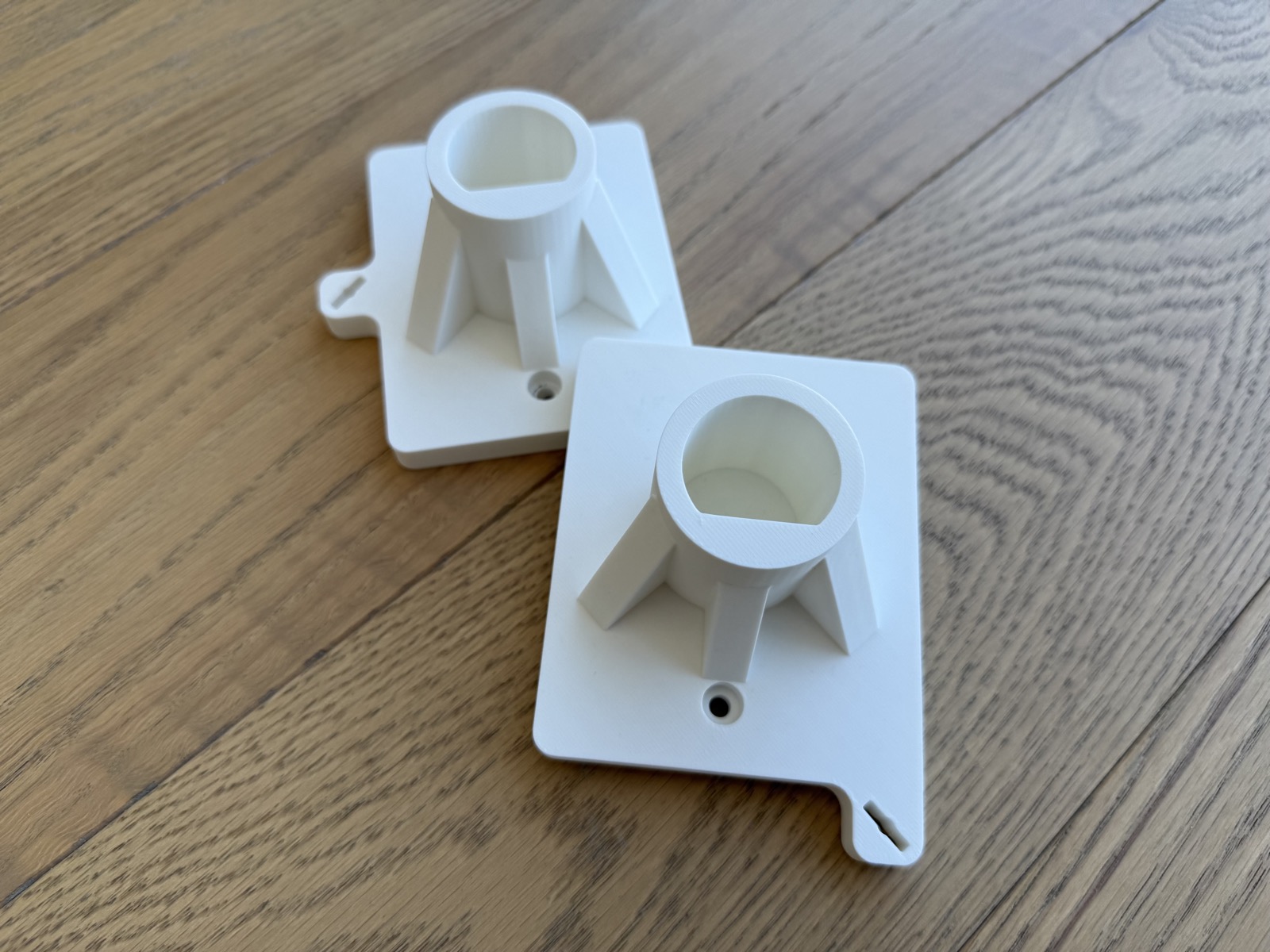
The solution was a set of custom 3D-printed brackets, glued to the back of each continent and screwed into the wall. They hold the map a little proud of the surface, hide the gap, and let me easily unmount a continent and put it up again if anything ever needs fixing.
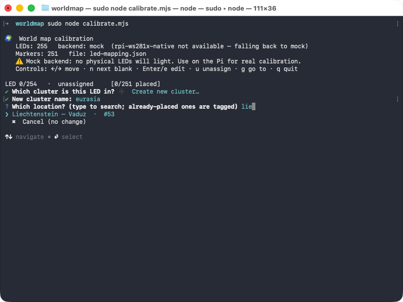
¶ Calibration
At this point I had a wall full of LEDs and no idea which was which. An addressable LED strip only knows its lights by number (LED 0 to 246, in my case) and has no concept of geography. Somewhere I had to tell it that LED 47 was Tokyo and LED 48 was Seoul.
So I had Claude build a small calibration tool for exactly that. It lights up one LED at a time; I look at the wall to see which city just came on, type in its name, and move on to the next. Repeat that a couple of hundred times and you end up with a complete map from LED number to real-world location.
¶ The wire format
Once I had a basic test lighting up LEDs on command, I started thinking about how I'd actually feed data to the map. I knew I wanted to display Netlify traffic, but I didn't want to tie the map to any one source of data.
I wanted a wire format that was agnostic of where the data came from, so that any source could drive the map without knowing anything about the hardware underneath. The format I landed on is simple. A source never talks to the LEDs at all; it just emits a small JSON document describing what it wants shown: a title and a list of points. Each point names a place by its ISO country code (optionally narrowed to a region, like US-CA or GB-SCT) and says how to light it: a colour, a brightness, and a blink rate.
{ "title": "Global earthquake activity (last hour)", "points": [ { "country": "JP", "color": "#ff3300", "brightness": 0.9, "blink": 0.4 }, { "country": "US", "region": "US-CA", "color": "#1f6feb" } ]}A small Node application then reads a config file listing the sources and shows one at a time, polling the active source on its own interval and refetching as the data changes. For every point, it looks up which physical LED corresponds to that country or region (using the mapping built during calibration), then lights it at the requested colour and brightness, toggling it on and off in a render loop if a blink rate was given.
The nice thing about this split is that adding a new data source has nothing to do with hardware. A source only has to translate its data into that one little format, and the map already knows how to render it. Some sources are just static JSON files, while others are long-running collectors that the display starts up on demand and shuts down again when I switch away.
¶ Feeding real data
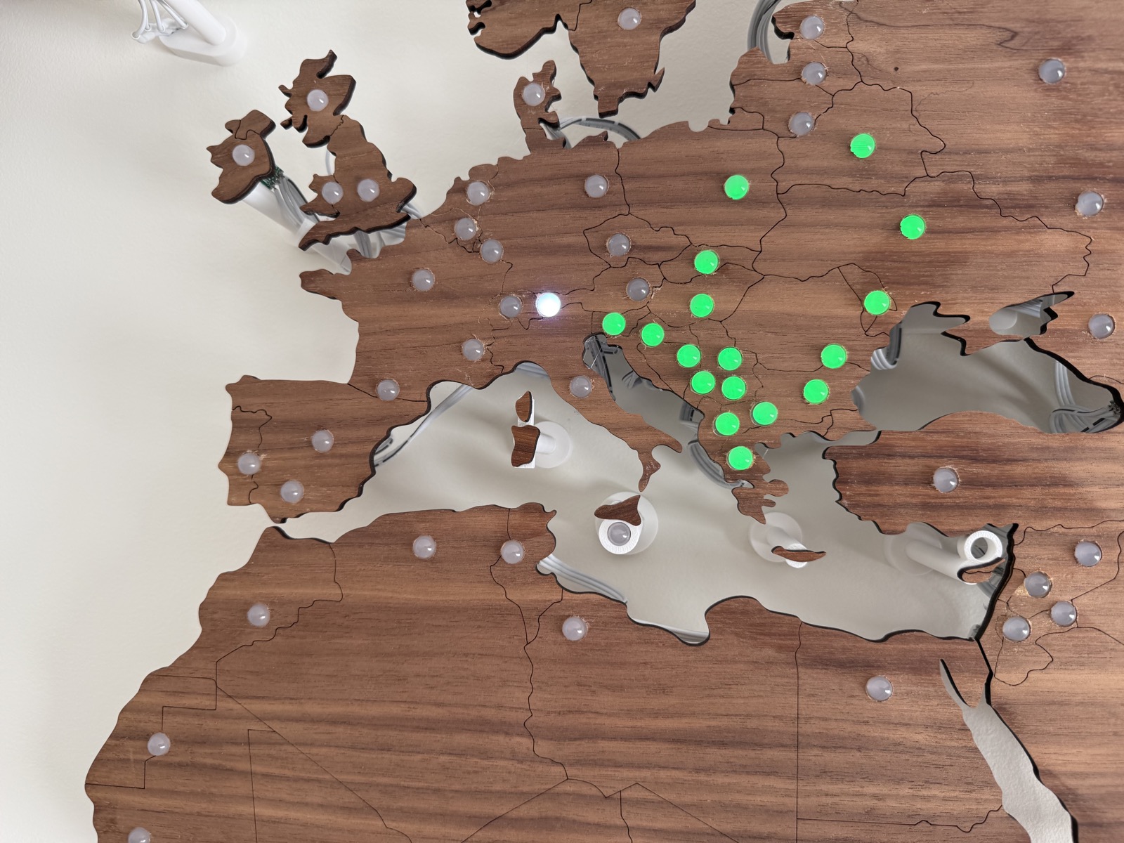
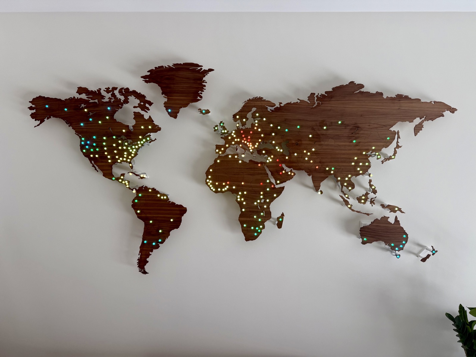
For the first real data source, I wanted something simple, global, and always changing, so I reached for the weather. A free weather API gives me the current temperature at each location on the map, and I colour every LED accordingly: deep blue for freezing, shading through to red for hot.
The result was a live temperature map of the world on my wall. It looked great.
And then, finally, the data source that started the whole project: Netlify CDN traffic.
This data source pulls in a live view of where requests are coming from, maps each one to a location on the globe, and turns that into something the map can show. Instead of colour, it uses motion: the more traffic a region is sending, the faster its LED blinks. Quiet corners of the world tick along slowly, while busy ones pulse rapidly.
¶ Wrapping up
There's a lot more I'd like to build. I have an e-paper display lying around and I'd love to build a controller unit that lets me see which data source is currently loaded on the map, and flip between them with some physical buttons.
I also want to have a web UI where people from all over the world can interact with the map and submit their own data sources.
Maybe one day I'll get to that.
For now, know that when you visit a Netlify site, you'll show up on my wall. I think that's pretty cool. ∎